Optimising the existing product pages to mainly improve the mobile user experience, while taking care not to compromise the desktop user experience.
Key Results
The Challenge
Over the years Secretlab has seen an increase in product types, and thus the website had to accommodate an increasing amount of information. The previous iteration of the product page flow was not designed for scalability, and the unclear hierarchy hindered users from finding the information they were looking for. The previous design also did not employ a mobile-first approach, leading to a frustrating mobile browsing experience.


As this was a classified project involving an upcoming launch, an internal focus group with stakeholders and other staff was done to collect feedback and assess the effectiveness of the existing product page.
The feedback from the focus group was then cross-analysed with online data tools to verify if these problems were occurring on a larger scale.
Identified Pain Points
Information types are scattered throughout the page and do not follow proper grouping or hierarchy
Most users do not scroll past a certain point in the page due to its length and design, making it hard to find key information
Users are unable to find product features without dropping off to the features pages
On landing, the product feels bland and unimpressive
Due to the amount of variants, mobile browsing feels cumbersome
Jobs to be done
How might we present an info-heavy page in a digestible way for users?
How might we improve the mobile browsing experience on this page?
How might we elevate the brand using the product page?
How might we design a product page with scalability in mind?


Using the information gathered in the user research, we designed solutions targeting the major pain points. Listed below are the main optimisations.
Gallery component optimisation
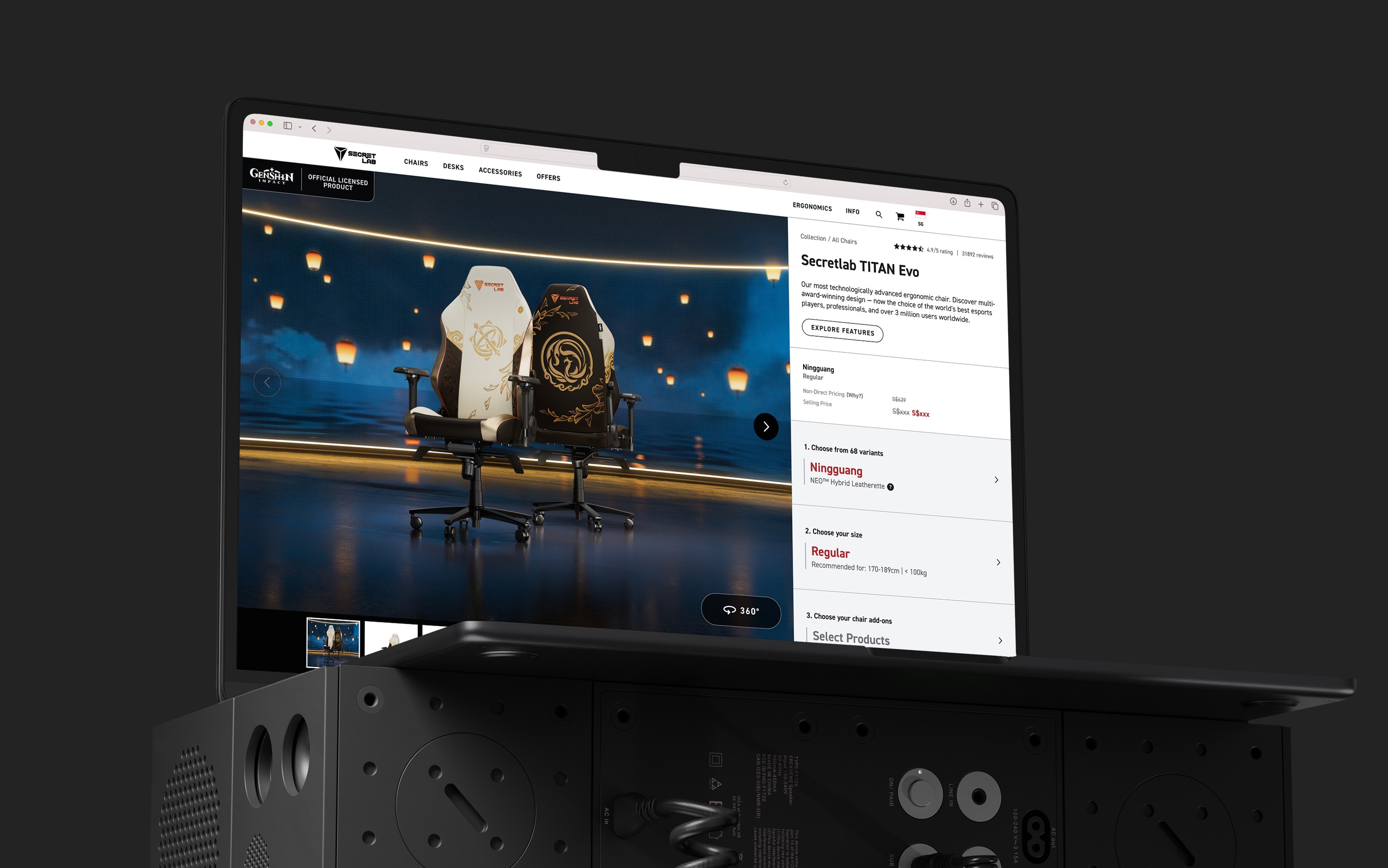
Secretlab has customarily displayed 360° turntables as its main product page image as it was thought to be the most efficient way to view the chair from all angles. However as the company expanded its product line, many products began to look particularly lackluster when following this convention.
On heatmaps, the gallery images were one of the most interacted parts of the product page. Baymard Institute's UX research also suggests that impressive product page images on landing play a surprisingly huge factor in conversion rates; and with a large proportion of our online ads going directly to the product page, this was something that we wanted to explore.
We designed a toggle component that could switch between the gallery and 360° turntables effectively, and also made the gallery images the default view.

Features & Specifications optimisation
In the focus group, there was feedback that due to the product information being scattered throughout the page, key product features were being missed as they were situated below the primary CTA. Participants assumed that all content below the CTA were more technical specifications that they were not interested in at the time.
Corresponding with heatmaps, we found that not many users were scrolling past a certain point in the page nor interacting much with the content below the CTA.
We revamped the way key Features were presented into a non-intrusive pop-up right at the top of the page, while situating more technical Specifications after the primary CTA. Sections below the primary CTA were also collapsed into accordions with clear headers for a more opt-in approach, instead of overwhelming the user with information upfront.

Variant drawer quickview (Mobile)
Due to the nature of the variant selectors being in drawers, mobile users were observed to be repeatedly opening and closing the variant drawer to view gallery images of their selected variant, leading to a very inefficient browsing experience.
Some participants in the focus group also expressed that they wished that the variant name was visible upfront, as they might be looking for a variant by IP name (i.e. Dark Knight) and might not be familiar with what that variant might look like.
We designed a quickview in the form of a magnifying glass button attached to the side of the selectors that opened a lightbox gallery of images, allowing users to stay within the variant drawer while browsing.


Methodology
We conducted a face-to-face usability testing session with 5 participants. Due to confidentiality these participants were company staff, however we chose participants who were largely unfamiliar with our website. Participants were invited to perform a series of tasks on our prototype with a mobile phone, each session lasting 30-40 minutes. Any verbal and non-verbal indications of usability issues and suggestions for improvement were recorded.
Key Findings & Design Recommendations
Key findings across participants were sorted into buckets and solutioning was prioritised according to UX severity. UX severity is defined according to three factors - Impact, Frequency and Persistence. The prototype was further refined based on the recommendations.
Findings
Severity
Recommendation
1
Features & Specifications optimisation
All users found the collapsed sections useful and were able to find specific information they needed
N/A
Optimisation is overall a success.
2
Variant drawer gallery pop-up
2 participants mentioned that the swiping capabilities in the image gallery was not immediately clear to them
Negligible
To add arrows to indicate that users can click or scroll to view more images.
3
Variant drawer gallery pop-up
4 out of 5 participants found the magnifying glass and felt that it was useful for reviewing multiple designs at a time
N/A
New feature is overall a success.
Could explore making it visually more attractive.
4
Gallery component optimisation
All users preferred the main gallery image as the default as the product looked more visually appealing
N/A
Gallery view should remain as default.
5
Gallery component optimisation
2 participants did not realise that the mobile gallery was swipe-able in viewport
3 participants mentioned that the 360° toggle button was not obvious enough on desktop
Significant
To add arrows to indicate that users can click or swipe to view more images.
To make 360° toggle button more obvious by increasing size and adding icon


Monitoring & Next Steps
Post-launch, we monitored the pages at 2 weeks and 1 month intervals to ensure that there were no unintended bugs and to catch any oversights concerning the user experience.
Monitoring tools were also used to track how users at scale were interacting with the new implementations, and to inform any further optimisations.