Building a design system from scratch for an existing brand and driving its implementation while maintaining BAU webpage development for various launches and campaigns


Before my tenure at Secretlab, the company did not have a robust design system; both designers and developers were not following a convention, and thus many implementations were not standardised across the website.
Building a design system for a new brand is complex, but building and implementing a design system for an existing brand — that at the time was already serving more than 2 million customers across 9 regions — required much more in-depth consideration and project planning.
Our aim was to elevate and harmonise the branding across the site, while maintaining a certain level of freedom for more experimental design.
The methods of putting together the design system was referenced from Material 3, Carbon and Microsoft Fluent design systems.
I used ClickUp as my primary tool for project planning, and plotted key completion dates against other ongoing launches to ensure that the team was on task and meeting delivery deadlines.

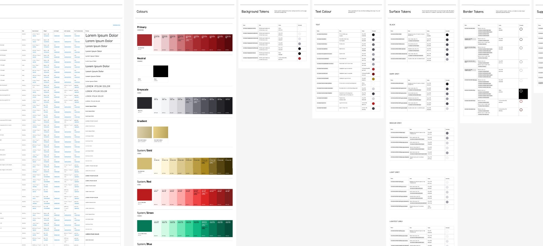
We started from the base elements — typography, colours, spacing and grids — which were then converted into appropriate tokens. These are the atoms of the design system, and the building blocks of any components that will come hereafter.
The roles of each element were detailed alongside their titles as a base guideline for designers.


Global components are components that will be used throughout the website, from navigation bars and CTA buttons to input fields and selectors. Building these global components before moving to more page-specific components would allow for less repeat work as well as more standardisation from page-to-page.
Guidelines were also created to inform designers and developers of proper usage.


Lastly, Phase 3 was focused on building major page-specific components particularly for pages in the main purchase flow, such as the Product Page and Product Grid Page. Instead of restrictive full-page templates, we favoured smaller mix-and-match components to encourage a more dynamic and flexible approach to designing pages.


As with any implementation, preview checks are a necessary step before launch to ensure that as little as possible bugs make it to the live site. While placed as the last step in this portfolio, preview checks usually happen at the end of every single phase before moving to the next phase, so that bugs can be caught before they become more incremental.