Redesigning the Product Grid
Redesigning the Product Grid
OVERVIEW
OVERVIEW
OVERVIEW
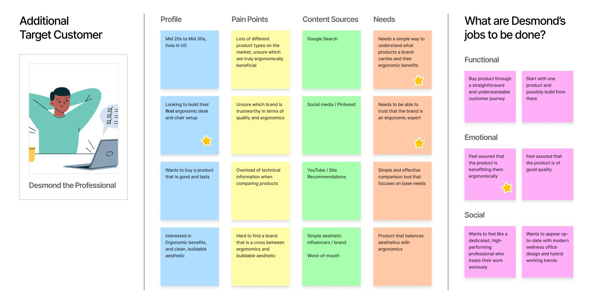
To complement changing business strategy, a redesign of existing pages was done to reducing cross-platform and cross-device friction, as well as introduce ergonomic education through progressive disclosure to capture a new target audience.
To complement changing business strategy, a redesign of existing pages was done to reducing cross-platform and cross-device friction, as well as introduce ergonomic education through progressive disclosure to capture a new target audience.